Pitched Product Design:
0→1 Concepts Under Agency Speed
Two concept pitches where a marketing agency, with no standing product design function, stood up an agile product practice to take real client briefs from research to prototype.
Role
Product / UX Designer
Context
Agile product design pitch concept
timeline
Less in 2 months
Tools
Figma, Miro
The setup
Neither of these projects shipped — they were competitive pitch concepts, and that's stated plainly here. What makes them worth showing is the conditions they were made under. The agency had no formal product design structure, so for each pitch we assembled a cross-functional pod, defined a lightweight research-to-prototype process, and delivered on a compressed timeline — effectively building the product design muscle as we used it.
Across both, the working pattern was the same: team up (a small pod of strategy, design and PM working in tight loops), research (motivation and pain-point mapping before any UI), design (low-fi through mid/high-fi, iterating closely with the team), and deliver (a concept and prototype built to make a future state tangible for the client).
**Brand assets, client names, and proprietary terms have been anonymized. These are independent concept explorations and are not affiliated with or endorsed by the clients.
Courtside Companion
Concept companion app for a console basketball video game franchise
context
The brief was open: find ways for the game's mobile companion app to deepen engagement and improve year-over-year retention across every kind of player, from casual newcomers to committed veterans — without trying to replace the console game.
What we did
We started from a broad research and ideation board, mapping player motivations (competition, belonging, mastery, identity) against documented pain points — pay-to-progress perception, gameplay imbalance, community toxicity, and information scattered across channels. Those insights drove a set of design principles and a mid-fidelity feature architecture spanning a persistent dashboard, a career hub with year-over-year and you-vs-crew analysis, a data-driven coaching loop, social clips, and light gamification.

What it was built to move
Companion-app DAU/WAU and return frequency, cross-platform retention from console players, challenge completion, clip shares, and push-driven re-entry into the game.
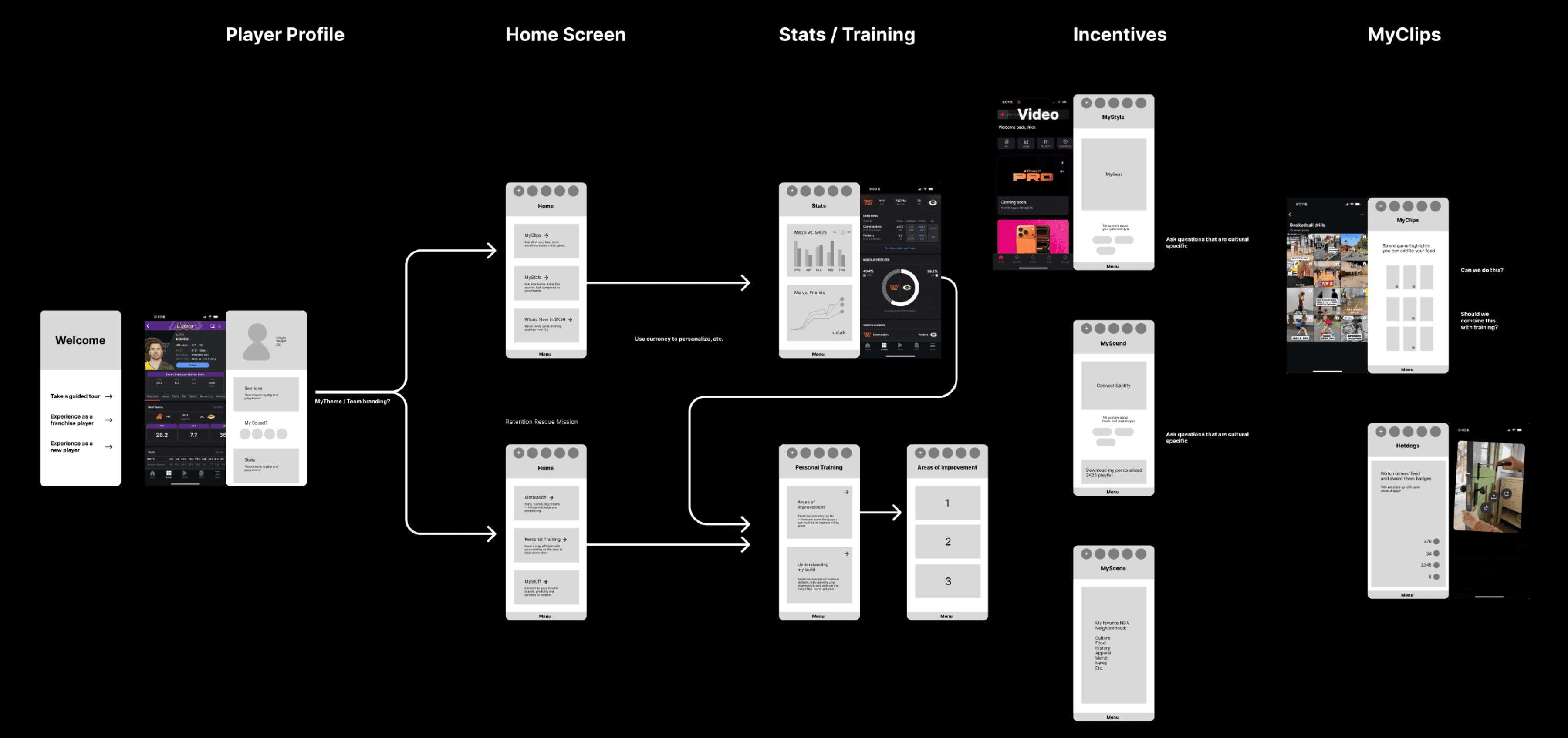


dashboard
Player profile overview
Virtual Currency Wallet
Top-line player stats
Schedule-like events
Challenges
Friend activity
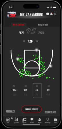
career hub
YOY personal analysis
You vs. Crew analysis
Drives user into training / gameplay

coaching
Badges
Stat trends
Data-driven coaching videos
Curated content from influencers
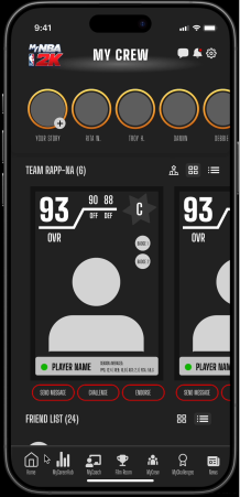
gamification
Crew leaderboards
Matchup simulators
Challenges in app
What we learned
Ten surfaces was a strong exploration but more than a v1 needs — the next step would be ruthless prioritization around the "see your gap → get a nudge → play → see improvement" coaching loop, which is the real retention engine. The biggest open gap: community toxicity was a documented problem the concept only addressed indirectly.
What it added up to
Two briefs, two compressed pitches, and a repeatable 0→1 process that didn't exist at the agency before. The recurring lesson across both: speed and rigor aren't opposites if research comes first and the prototype is built to persuade, not just to demo. Both concepts ground every feature in a documented need — which is exactly the muscle I'd bring to a product team that ships.
Campus Compass
Student-experience platform for an online university serving working adults
context
The ask from client was to reimagine the digital student experience with a focus on improving engagement, retention, and self-service. The ask was to concept a future-state product vision that reduces reliance on manual support while empowering students to succeed independently.
Opportunity Areas

Strategic Vision
What we did
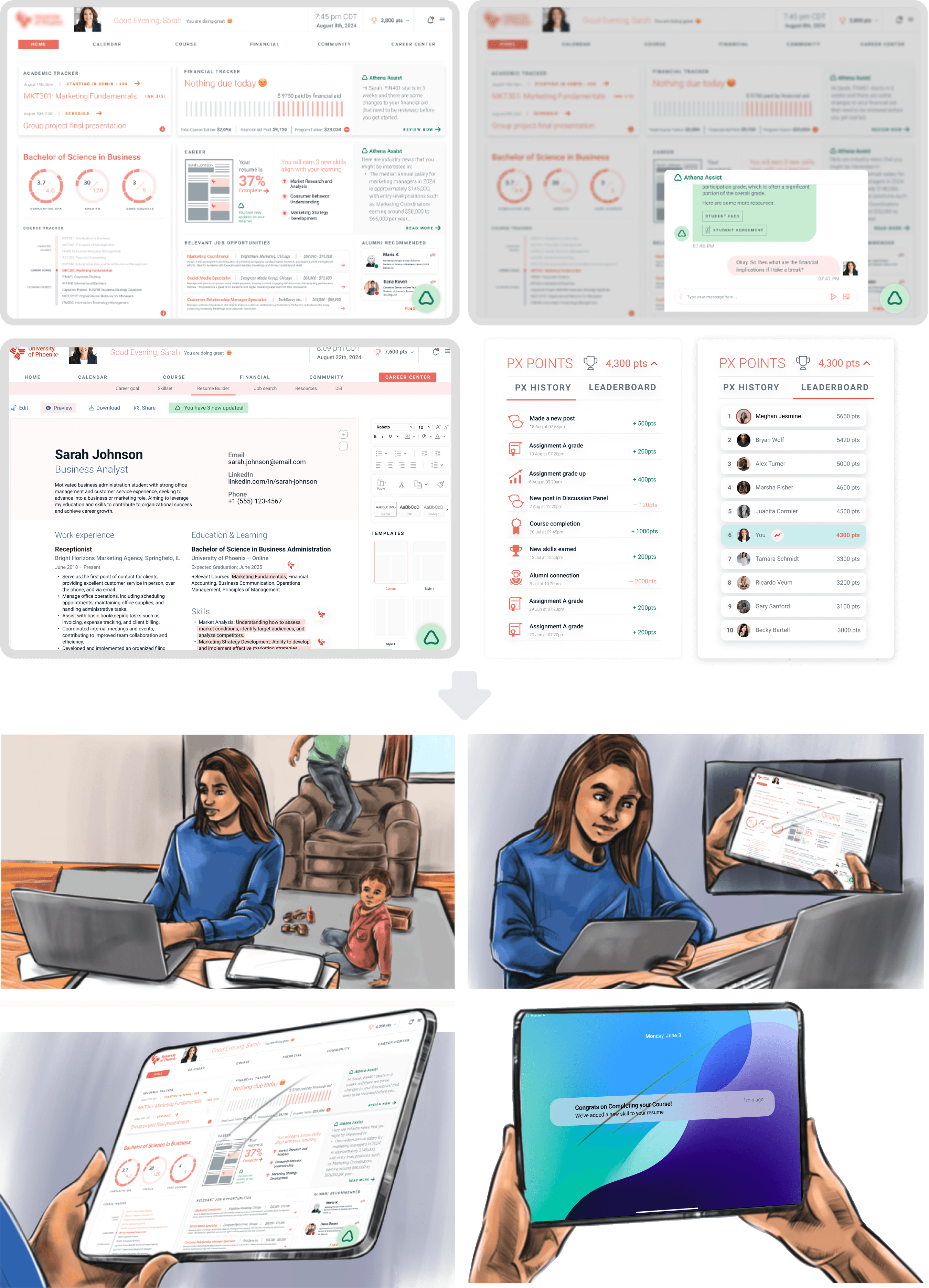
We moved fast from low-fi to mid-fi mocks in close partnership with creative, then into a clickable prototype carried by a narrative storyboard — following "Sarah," a single working parent, through a stressful stretch of her degree. The concept reframed the app from a set of disconnected utility pages into a connected student-success platform: an always-available AI assistant ("Athena Assist") as the connective layer, a personalized dashboard unifying coursework, finances, and resume progress, a community space for peers, mentors, and alumni, a resume builder and career center that translated coursework into job-ready skills, and a points-and-leaderboard motivation system.


What it was built to move
Student persistence and retention, support deflection, course completion, community participation, and career-tool engagement.
What we learned
The reframe — from "where do I find this?" to "the system surfaces what I need next" — was the whole idea, and the storyboard was what made it land with stakeholders, not the screens alone. Telling the story through a real student's week turned a feature list into an experience people could feel.