Lilly Assist
Lilly Assist is Eli Lilly's patient-facing chatbot deployed across multiple pharmaceutical brand sites. It existed. It was compliant. And patients weren't using it.
The redesign challenge wasn't technical — it was a tension that sits at the heart of healthcare UX: how do you make something feel human when every word has to survive legal review? Phase 1 was about finding that line and designing right up to it.
(The chatbot is temporarily disabled due site update)
CLIENT
Eli Lilly
Role
Lead UX Designer
Timeline
2025
Tools
Figma, Miro
The Problem Wasn't the Content
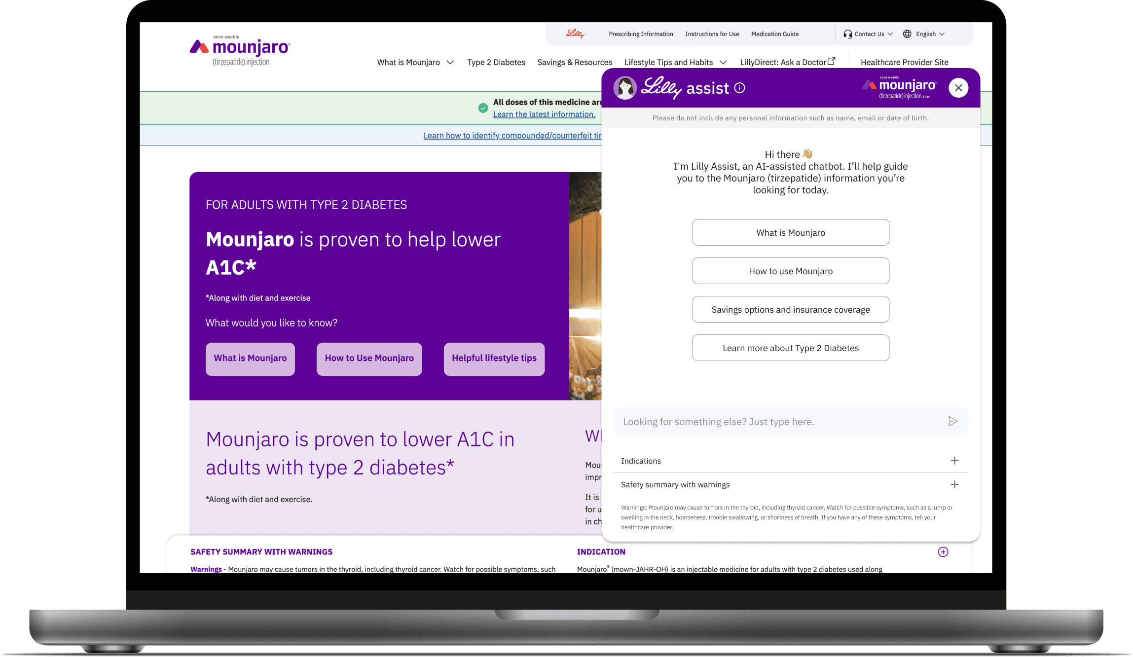
The existing chatbot had good information. What it didn't have was any sense of the person on the other end.
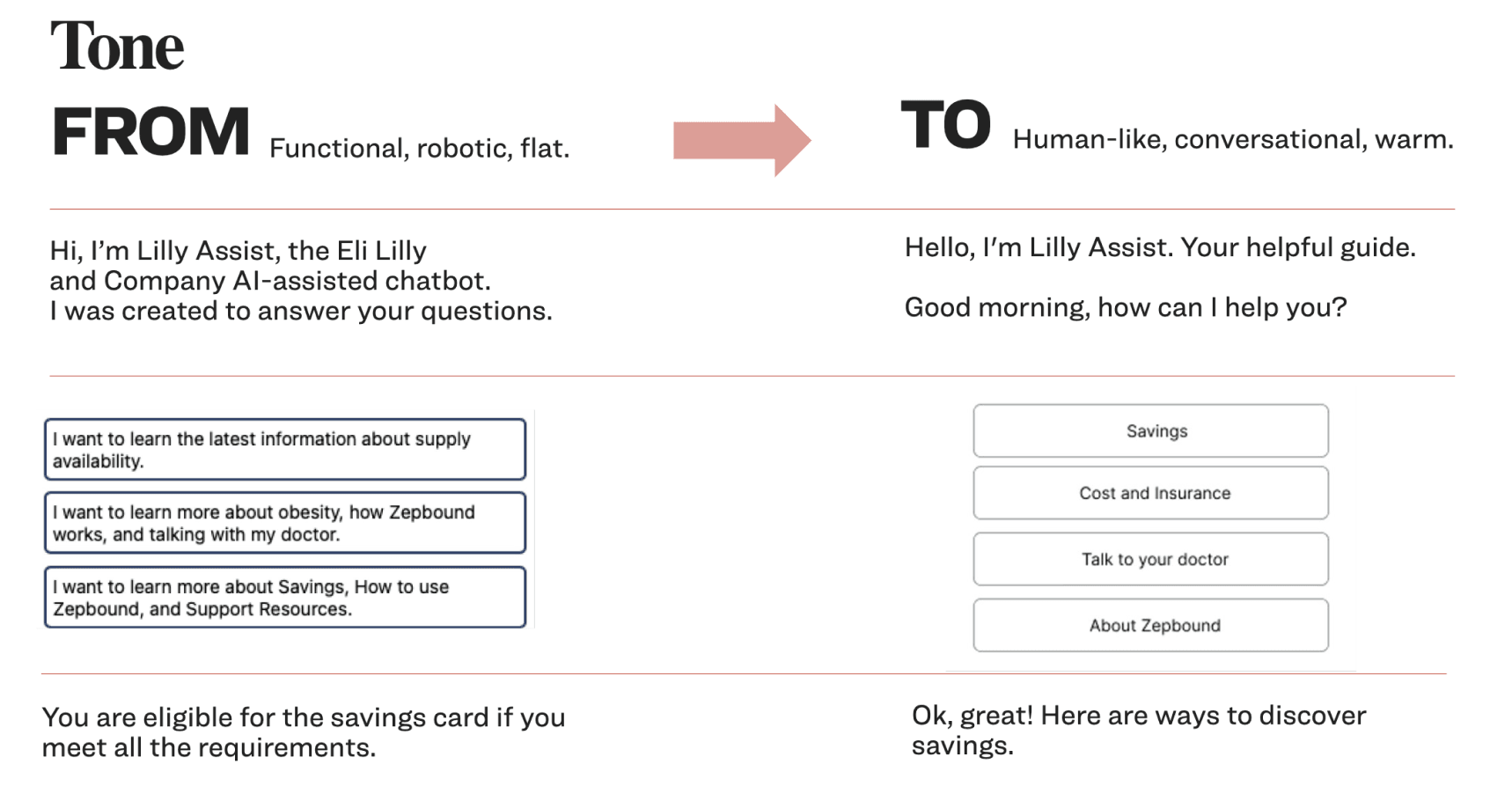
Responses were dense and robotic. Transitions were dead ends. The launcher said "Chat now!" like a banner ad. The chatbot introduced itself as "an AI-assisted chatbot created to answer your questions" — technically accurate, completely uninviting.
Internal audits confirmed what you'd feel immediately as a user: the experience was built to deliver information, not to guide people. In a healthcare context, where patients are often anxious, confused, or just trying to find out if they can afford their medication, that gap matters.
What We Were Actually Solving For
Before exploring any direction, I needed to understand what "better" actually meant within Lilly's constraints. The redesign had to align to their 2025 consumer chatbot capability vision — three pillars: 24/7 self-service, digital navigation, and virtual agent support.
That framing was useful because it shifted the question from "how do we make this friendlier" to "how do we make this genuinely useful at every stage of a patient's journey." Friendlier is a style choice. Useful within a care journey is a design problem.

Narrowing to Two Focus Areas
Competitive benchmarking and the internal audit pointed to a long list of things that could be improved. I pushed to narrow it before touching design.
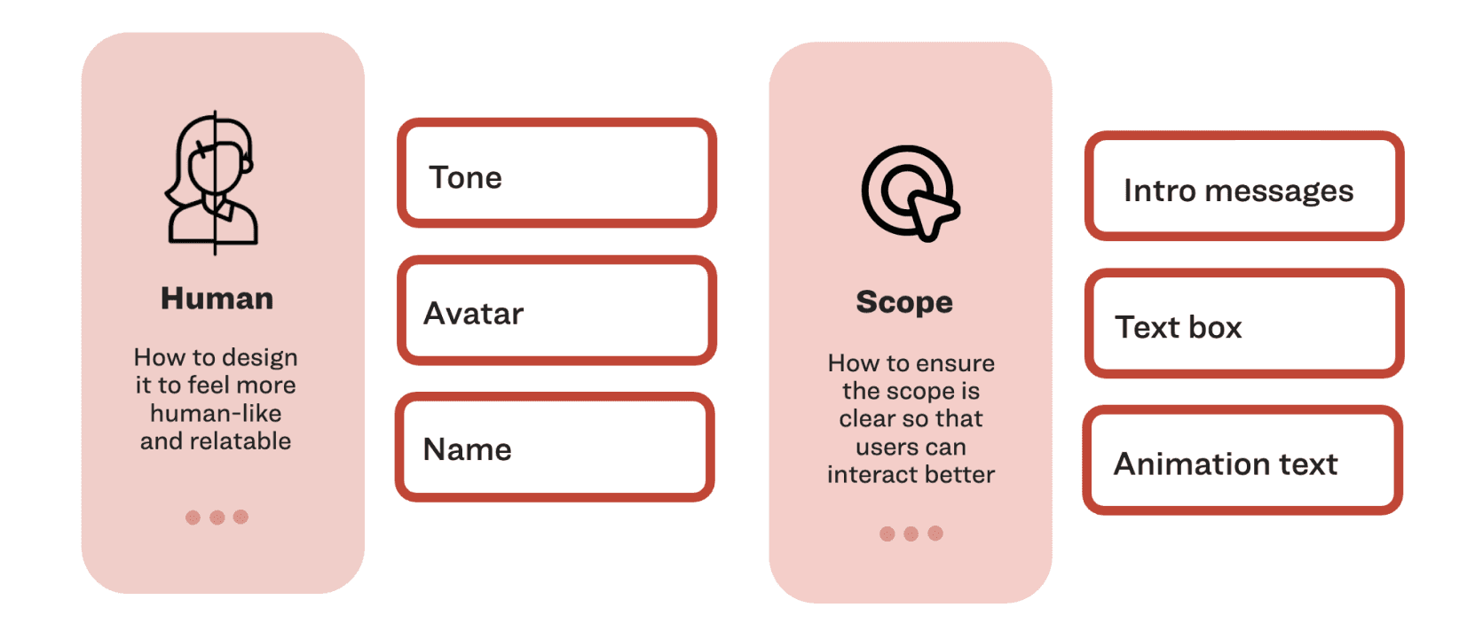
The team aligned on two: humanizing the interaction and clarifying scope. Everything else — session continuity, abandonment prevention, page context — was downstream of those two. If patients didn't feel like the chatbot was worth talking to, none of the other improvements would matter.
Human meant: tone, avatar, name, greeting. Scope meant: what does this chatbot do, and how do you know within five seconds of opening it.
The Compliance Constraint Was the Design Brief
This is the part that doesn't show up in most chatbot case studies: in pharmaceutical UX, warmth has a review process.
Every piece of language — the greeting, the prompt labels, the follow-up messages — went through legal and medical review. "I'll help you find the right information" is a meaningfully different legal statement than "I'll answer your questions." The tone shift from "You are eligible for the savings card if you meet all the requirements" to "Ok, great! Here are ways to discover savings" took multiple rounds to land.
The design constraint wasn't Figma components. It was figuring out exactly how much personality was permissible, and designing a system that could be warm without making clinical claims.
Seven Directions, One Decision Framework
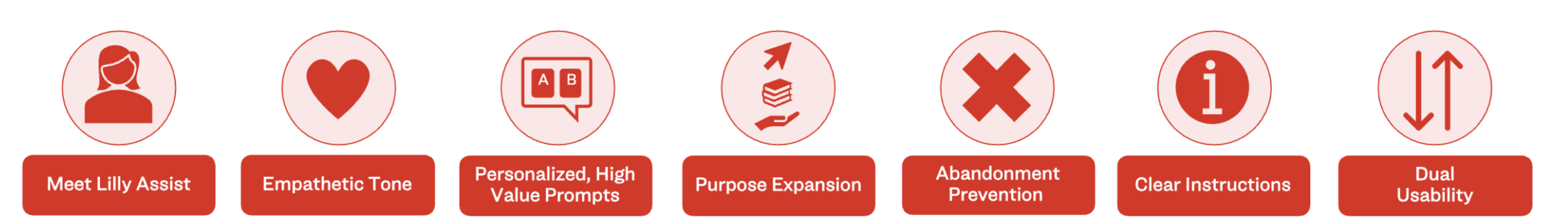
Before building anything, we mapped seven design concepts — each addressing a different dimension of the problem: persona, empathetic tone, purposeful prompts, purpose expansion, abandonment prevention, clear instructions, dual usability.
Each concept was evaluated against patient value and business value. That matrix wasn't just a presentation tool — it was how we prioritized which to prototype and which to defer. Not everything that would help patients was feasible under compliance constraints. Not everything that drove conversions was actually good for patients.
The two that moved forward to prototype were Lilly Assist Persona & Purposeful Prompts, and Empathetic Tone & Contextual Tracking — chosen specifically because they could be measured independently against a control.
Low-Fi: Getting the Launcher Right
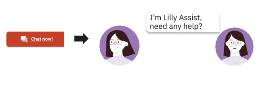
One of the earliest and most consequential decisions was the launcher — the first thing a patient sees before they've decided to engage.
I explored three directions: a static chat icon, a bottom-anchored bar, and a persistent avatar with a speech bubble. The avatar approach won not because it looked better, but because it did something the others didn't — it introduced the persona before the patient had committed to opening the chatbot. The relationship started earlier.

The Final Design
Two variants shipped for measurement.
Lilly Assist Persona & Purposeful Prompts: A distinct avatar and name replaced the generic chat icon. The greeting shifted from a legal disclaimer-style introduction to a warm, direct welcome. Structured CTAs replaced the blank text field as the primary entry point — reducing cognitive load and giving patients an immediate path to the most common tasks.
Empathetic Tone & Contextual Tracking: Language across the entire interaction was rewritten — not just the greeting, but responses, follow-ups, and transitions. Contextual tracking meant the chatbot's opening prompts adapted to the page a patient was on: someone landing on the savings page saw savings-specific entry points, not generic brand information.
Free text remained available throughout. The design decision was to make structure the default without removing flexibility — patients could explore or move fast, on their terms.

Results
We successfully published the new chatbot design alongside with Lilly’s cross brand website updates. Both variants were measured against a pre-launch baseline with comparable traffic levels. All results statistically At 2 weeks: +59% chatbot start rate sitewide · +81% on the homepage
At 1 month: +55% chatbot start rate sitewide · +61% on the homepage
The avatar and persona changes drove discoverability — patients who previously scrolled past the launcher started engaging with it. The empathetic tone and contextual tracking drove depth: +19% average engagement per session, and first prompt rate on the savings page increased from 1.1% to 1.5%.
The one-month numbers holding close to the two-week numbers mattered. It ruled out novelty effect. The experience was genuinely better, not just new.
The redesign shipped as a reusable conversational UX standard — tone guidelines, interaction patterns, and component decisions that carried forward to future brand launches across the Lilly portfolio. Phase 1 proved the model. The same approach is now the baseline for how Lilly approaches patient-facing digital support.